
Updated: .
WCAG is a set of accessibility requirements. APCA is a contrast assessment model. The useful comparison is between APCA and WCAG 2's contrast method, not the entire standard. Today, APCA can supplement design decisions; it does not replace WCAG 2.2 conformance testing.
What WCAG 2 measures
The contrast ratio is calculated from the relative luminance of the lighter and darker colors: (Llighter + 0.05) / (Ldarker + 0.05). It ranges from 1:1 to 21:1. Swapping the text and background colors leaves the number unchanged.
For AA criterion 1.4.3, normal text needs at least 4.5:1 and large text needs 3:1. Large text means at least 18 pt, or 14 pt in bold: approximately 24 and 18.67 CSS px, respectively. Do not round a result up to a pass: 4.499:1 does not become 4.5:1. For AAA, criterion 1.4.6 sets thresholds of 7:1 and 4.5:1, respectively. Logos, decorative text, and certain other kinds of text have exceptions.
A control's boundary and its label require separate checks. Visual information needed to identify a component, its state, or meaningful graphics is covered by criterion 1.4.11, with a 3:1 threshold against adjacent colors and its own exceptions. This does not mean every button needs a contrasting border.
What APCA changes
APCA, the Accessible Perceptual Contrast Algorithm, calculates lightness contrast, expressed as Lc. It accounts for polarity: dark text on a light background generally produces a positive result, while light text on a dark background produces a negative one. A negative number does not mean poor contrast. Interpretation depends on the magnitude and the conditions of use.
Keep the calculation separate from typography recommendations. The core APCA function takes the luminance of the text and background. Font size and weight inform interpretation through recommendations and lookup tables; they are not inputs to that basic calculation.
In the APCA author's recommendations, for example, Lc 75 is associated with body text at particular sizes and weights, while Lc 60 relates to other reading conditions. This does not establish a universal “anything above 60 passes” rule. Nor can Lc be treated as a percentage or converted exactly into 4.5:1.
Will APCA become WCAG 3?
As of November 5, 2026, the published WCAG 3 Working Draft dated September 10, 2026 leaves the contrast algorithm undecided. Its Text contrast sufficient section explicitly states that the algorithm is yet to be determined. The document itself is a working draft, not a current W3C Recommendation.
Calling APCA “the future WCAG will definitely adopt” therefore presents an expectation as an agreed decision. A more accurate statement is that APCA developed as a candidate for a new approach to contrast and is useful for additional assessment, but W3C has not made a final decision. The npm package name apca-w3 does not, by itself, confer normative status.
Our own examples instead of a “real perception” checkmark
The following are our own color pairs, not values extracted from someone else's screenshot. All colors are opaque sRGB, without gradients or blending. APCA was calculated using apca-w3 0.1.9, algorithm 0.0.98G-4g. The illustration uses Arial at 24 px and weight 700; a separate table column checks the 4.5:1 threshold for normal text.
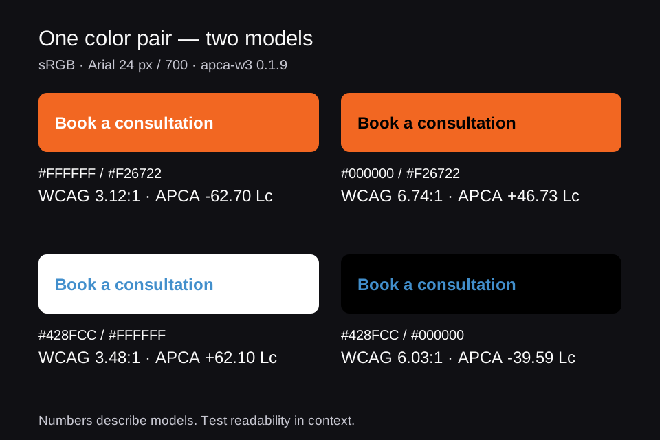
| Text / background, sRGB | WCAG 2 | APCA | Normal text AA, 4.5:1 |
|---|---|---|---|
| #FFFFFF / #F26722 | 3.12:1 | -62.70 Lc | No |
| #000000 / #F26722 | 6.74:1 | +46.73 Lc | Yes |
| #428FCC / #FFFFFF | 3.48:1 | +62.10 Lc | No |
| #428FCC / #000000 | 6.03:1 | -39.59 Lc | Yes |
| #FFFFFF / #B54500 | 5.50:1 | -81.88 Lc | Yes |
| #767676 / #FFFFFF | 4.54:1 | +71.57 Lc | Yes |
| #FFFFFF / #767676 | 4.54:1 | -77.04 Lc | Yes |
White on #F26722 has a WCAG ratio of 3.12:1: insufficient for normal text, but sufficient for the 3:1 large-text threshold. Black on the same background reaches 6.74:1, but has a lower absolute Lc value. The models assess these pairs differently. This does not prove that nobody can read the black label or that the white one suits everyone.
Also consider #767676 and white: swapping the colors leaves WCAG at 4.54:1, while APCA changes from +71.57 to −77.04 Lc. This illustrates a difference between mathematical models without turning it into an argument about personal taste.
The “Real perception: ✓” line in popular comparison graphics creates false certainty. Such a conclusion would require participants, documented visual characteristics, devices, lighting, font size and typeface, a reading task, and a measured outcome. Our examples demonstrate disagreement between assessments; they are not that kind of study.
The calculation data in JSON includes source colors, unrounded values, the implementation version, and the source file's SHA-256 hash. To reproduce the results, use APCAcontrast(sRGBtoY(textRGB), sRGBtoY(backgroundRGB)) from that implementation; WCAG uses the formula above after converting sRGB to linear luminance.
How to make a decision in a real interface
- Define your conformance target and test it using the method in the applicable WCAG version.
- Measure the actual background across hover, focus, disabled, error, and selected states, in light and dark themes. For transparent text, account for the resulting blended color.
- Assess APCA as an additional measure alongside typeface, size, weight, and purpose. Record the tool version.
- If the result is questionable, change the color pair or typography. Do not replace an unsuccessful check with a more convenient metric.
- Test readability in tasks with people from your audience.
For example, white text on the darker orange #B54500 produces 5.50:1 and −81.88 Lc. This is a candidate for further testing that meets the WCAG AA threshold for normal text. That change is more productive than trying to prove that one of the previous samples is “objectively correct.”
Contrast should not carry all the meaning
Even excellent contrast does not solve an error indicated only by color, or chart series distinguished only by hue. Add explanations of errors, labels, markers, and line patterns. Color vision deficiency simulation can help identify some problems, but it does not reproduce everyone's experience.
Sources and the status of standards checked on November 5, 2026.
Apply these practices with an AI agent
Based on this research, we created open skills for Codex and Claude Code to help analyze and improve websites and applications. Accessible UI guides checks of semantics, keyboard interaction, focus, forms, and contrast; Adaptive Interfaces helps adapt layouts to window sizes, text scaling, the keyboard, and foldable devices. The agent examines the actual project, proposes evidence-based improvements, and verifies the agreed changes. These skills do not replace testing with users and assistive technologies.
The practical guidance from this series is collected in the Accessible UI skill on GitHub: semantics, keyboard interaction, focus, forms, contrast, and verification. The instructions are in English. See the installation instructions and invocation examples in the first article.