
Updated: .
A native select is a reasonable starting point for a straightforward choice. A custom component needs a product reason; along with its appearance, you take responsibility for its semantics, keyboard interaction, focus, states, and assistive technology compatibility.
Start with a field that already knows how to be a field
<label for="topic">Request topic (required)</label>
<select id="topic" name="topic" required>
  <option value="">Choose a topic</option>
  <option value="design">Interface design</option>
  <option value="development">Development</option>
</select>
This is a complete foundation for a choice, not a visual placeholder to hide from screen readers. It still needs good layout, contrast, clear options, and error handling, but the platform provides its basic interaction model.
Why switching between two selects is unreliable
One suggested approach shows the native select on :focus-visible and keeps a custom version for clicks. This creates two versions of one field without guaranteeing that either is accessible. Input method does not determine whether assistive technology is present: a phone screen reader uses gestures, and a person may alternate between a mouse and keyboard.
opacity: 0 does not remove an element from the accessibility tree or focus order. pointer-events: none changes pointer handling but does not address the other issues. aria-hidden hides semantics but does not itself prevent focus. The result can be an invisible focusable element or two presentations of a field with different values.
A hybrid is possible only as an independently designed and tested architecture. It needs one source of truth for the value and correct reset, disabled, required, validation, and form submission behavior. A hidden native field does not, by itself, prove the custom part is accessible.
What a custom selection control must deliver
Before writing event handlers, choose the exact pattern. Selecting from a list without text entry is not the same as a searchable combobox. Do not mix menu, listbox, and combobox roles merely because they all look like dropdowns.
- The accessible name, role, and current value must be understandable.
- The expanded state and relationship with the list must be exposed programmatically.
- The selected option and active option are different states; do not confuse them.
- Keys for opening, moving, confirming, canceling, and searching must follow the chosen pattern.
- Focus either moves according to a consistent model or remains on the control with a correct aria-activedescendant.
- Submission, reset, errors, and unavailable options must stay consistent with the visible interface.
Use the APG combobox pattern as a behavior specification. It does not promise that every copied example will work identically in all browsers and screen readers: APG explicitly calls for compatibility testing.
An error should explain how to fix it
“Invalid value” makes people guess. “Enter an email address in the format [email protected]” gives them an action. Do not replace a label with a placeholder, which disappears during entry. Preserve entered data after an unsuccessful submission and associate the explanation with the relevant field.
<!-- Example state after an error has been detected -->
<label for="email">Email</label>
<input id="email" name="email" type="email" value="name@"
  autocomplete="email" aria-invalid="true"
  aria-describedby="email-error">
<p id="email-error">Enter an email address in the format [email protected].</p>
Do not mark every empty field aria-invalid before an error has occurred. When the error is corrected, remove the invalid state and update the message. For multiple errors, an error summary linking to the fields is helpful; after a successful submission, provide a clear confirmation that does not require visual searching.
A modal dialog controls more than its appearance
Opening a dialog requires a meaningful initial focus position. In a modal state, Tab must not move into the background, and the background must not remain interactive. The dialog needs a clear name and an accessible way to close it. After closing, focus usually returns to the trigger, or to the next logical location if that trigger no longer exists.
Do not set aria-modal="true" on something that merely looks modal. The attribute does not implement focus containment or block the background. In a long dialog, focusing the first field immediately is not always appropriate: people may miss the heading and instructions.
Authentication is part of accessibility too
Do not block password pasting or password managers. For one-time codes, test pasting the entire code and autofill: six decorative boxes should not demand six separate efforts. Criterion 3.3.8 AA limits mandatory cognitive function tests during authentication, but includes conditions and exceptions; it is not an absolute ban on all CAPTCHAs or passwords.
Test transitions between states
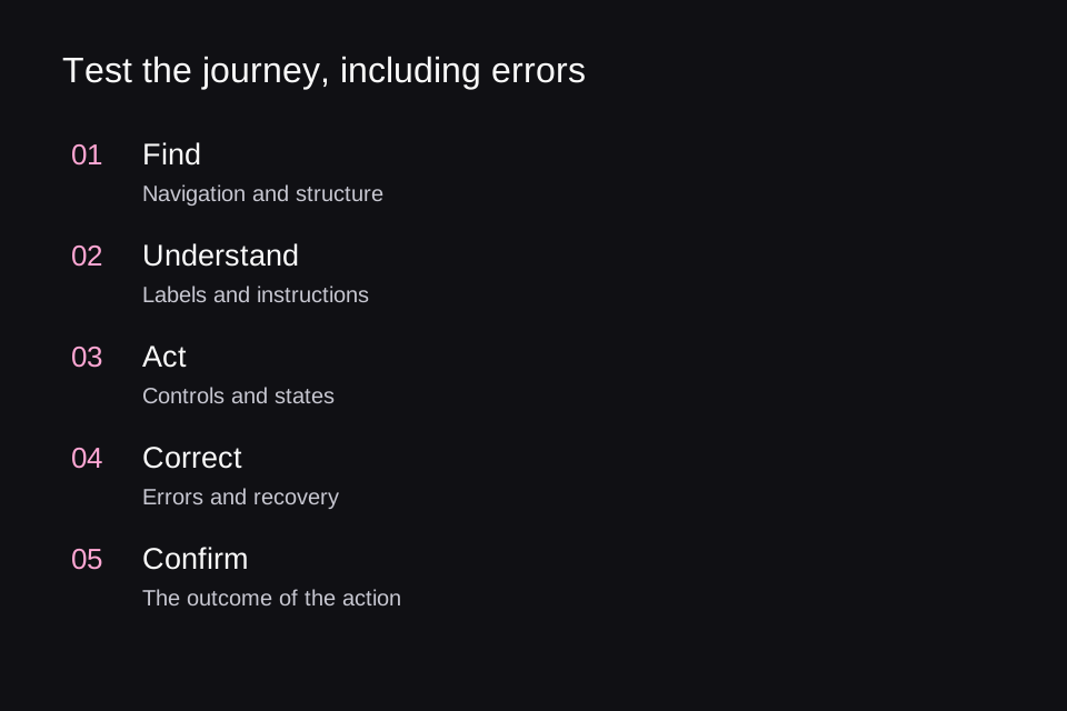
A single field needs at least empty, entered, error, corrected, submitting, and complete states. A list adds open, no results, and option selected. In each state, check what is visible, what is announced, where focus is, which value will be submitted, and how to cancel.
This state matrix finds more real defects than comparing a closed select with a mockup. Pay particular attention to network delays: a disappearing submit button can lose focus, while repeated activation can create duplicate requests. The solution must maintain a clear status and predictable controls.
Sources and the status of standards checked on November 5, 2026.
Apply these practices with an AI agent
Based on this research, we created open skills for Codex and Claude Code to help analyze and improve websites and applications. Accessible UI guides checks of semantics, keyboard interaction, focus, forms, and contrast; Adaptive Interfaces helps adapt layouts to window sizes, text scaling, the keyboard, and foldable devices. The agent examines the actual project, proposes evidence-based improvements, and verifies the agreed changes. These skills do not replace testing with users and assistive technologies.
The practical guidance from this series is collected in the Accessible UI skill on GitHub: semantics, keyboard interaction, focus, forms, contrast, and verification. The instructions are in English. See the installation instructions and invocation examples in the first article.