

Updated: .
A good app helps people even when its screen is closed. An island shows when the car will arrive. A watch lets you pause a workout. A widget reminds you of the next task. A ticket opens at the gate. This article is a practical atlas of these interactions: what to choose, where it works, how to integrate it, and how to keep a useful service from becoming a constant distraction.
Imagine an ordinary trip. Someone orders a taxi, returns to a conversation, notices the arrival time at the top of the screen, receives a signal on their watch, and heads out to the car. They use your product several times during that period while barely opening the app. This is the experience we will design.
Documentation snapshot: November 5, 2026. This is an overview of mechanisms and design decisions, not a lab test of every device. API availability, an app's access to it, and actual display on a phone are three separate conditions. The examples below are original illustrations; they explain information composition rather than reproduce a particular OS interface. By “surface,” we mean a place of interaction: the Lock Screen, a widget, a watch, a system card, or a physical indicator.
1. The guiding principle: reduce effort, not increase presence
Clients often frame the task as “Let's build Dynamic Island so users see our brand more often.” A better question is “What does someone keep coming back to the app to ask?” If the answer is “when will the courier arrive,” a compact status is justified. If it is “remember our subscription,” the additional surface will probably become advertising.
An external interface has four parts: context, useful information, an available action, and a condition for disappearing. For a taxi, these are waiting for the car, the ETA, contacting the driver, and the trip ending. For a habit widget, they are a daily routine, the current result, marking completion, and the option to remove the widget. If the team cannot describe all four, it is too early to draw a capsule.
A practical rule: bring out the answer people return to the app for. But preserve access to the full history, details, and error correction. A small card should shorten the path to a result, not hide complexity.
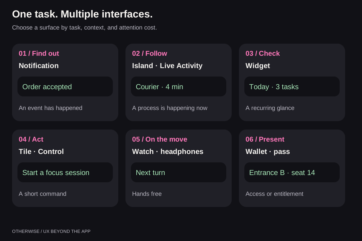
2. The complete map: from notifications to the physical world
Here, completeness means covering classes of interaction. No permanent list can include every model, manufacturer skin, and partner integration: they change independently. We will therefore start with stable categories, then examine platform differences.
| User task | Suitable surface | Example | Main boundary |
|---|---|---|---|
| Learn what happened | Regular notification, badge | Document ready | The event does not require continuous observation |
| Follow an ongoing process | Live Activity, Live Update, OEM capsule | Taxi arrives in 4 minutes | Needs a beginning, an end, and current data |
| Check familiar information | Widget, stack card | Today's tasks | Updates do not have to be continuous |
| Perform a short command | Quick Settings, Control, shortcut | Start a timer | The action must be understandable without a long form |
| Reply to someone | Notification reply, conversation bubble | “I'll be there in five minutes” | Needs recipient context and send status |
| Continue watching or calling | Picture-in-Picture, system media controls | Video while working with notes | The window must not obscure the main task |
| Receive information on the move | Watch, headphones, in-car interface | Next turn | Minimal reading and precise tapping |
| Present entitlement to a service | Wallet, ticket, pass, digital key | Boarding pass | Verify entitlement and data validity |
| Continue on another screen | Handoff, Cast, multitasking | Open a route on another device | Transfer context, not just an app launch |
| Interact with a nearby object | QR, NFC, BLE, UWB | Find a device or open its controls | Nearby discovery does not grant permission to act |
| Understand state without looking at a screen | Haptic, sound, or light signal | Interval finished | The signal cannot be the only way to receive information |
Another layer consists of in-app banners, snackbars, toasts, bottom sheets, coach marks, support chat, and message centers. They help when someone is already in the product. Do not confuse them with system surfaces: a website's floating button does not become a system island after the tab closes.
3. Choosing a surface: six questions before design
- Is the person waiting for a change or actively seeking information? An unexpected important event needs a signal. A widget often suffices for a daily check.
- Is the process happening right now? An ongoing trip and a delivery in three days need different presentations.
- Can the main point be understood at a glance? If someone needs to compare ten parameters, the small surface should open a full screen.
- Is an action needed? “Pause” suits a short control; “modify a complex order” usually needs the app.
- Who else can see the data? Lock Screens, watches, car displays, and speakers create different disclosure risks.
- What happens without permission or connectivity? Design this path alongside the main one, not after users complain.
A useful team test: remove the logo from the mockup. If the interface loses its meaning, it may have been created for brand presence. If “in 4 minutes,” “go to gate B,” or “pause workout” remains, you have found real user value.
4. Live Activities and Live Updates: similar goals, different mechanisms
Apple: ActivityKit manages the lifecycle
A Live Activity represents an ongoing task; Dynamic Island is one place it appears. ActivityKit manages creation, updates, and ending, while WidgetKit and SwiftUI define the interface. Design the different states: compact, minimal, expanded, and Lock Screen. Devices without an island remain part of the scenario.
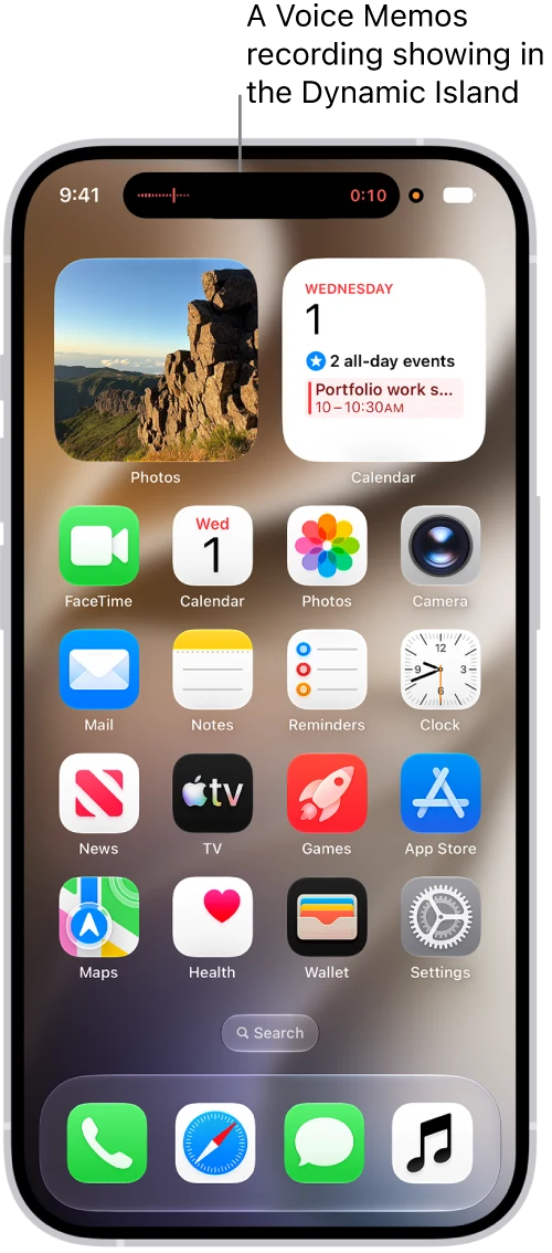
Duration and data limits, actions through App Intents, APNs server updates, and support for other screens are covered in the practical guide to Dynamic Island and Live Activities. Do not automatically transfer Apple Watch button capabilities to CarPlay.
Android: a semantic notification whose presentation the system chooses
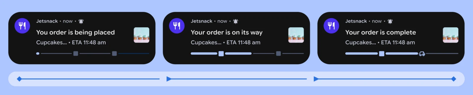
The app describes an ongoing activity and requests notification promotion. The system checks properties, settings, and availability. ProgressStyle suits stages; MetricStyle suits measured values on supported versions. Neither creating a notification nor having a new Android version guarantees a particular capsule.
The separate Android Live Updates guide covers Kotlin examples, permissions, styles, background updates, ending, and OEM integration checks. The user scenario, API eligibility, and actual display are verified separately.
What not to transfer between platforms
Do not apply an Apple limit to Android, Google's rules to a Chinese OEM channel, or support for a visual form to support for interactivity. Do not promise one shared pixel-perfect layout. Order state, text meaning, and commands can be shared; sizes, buttons, lifetime, and update transport remain platform-specific.
5. Android manufacturers: an access map, not a parade of logos
Samsung Now Bar, Xiaomi HyperIsland, OPPO Fluid Cloud, vivo Origin Island, and HONOR Magic Capsule solve a similar problem, but do not form one SDK. In some cases, a suitable system mechanism is enough; others need scenario approval, a specific template, and a manufacturer update channel.
When assessing integration, check four things: model and firmware, market, access for the specific app, and the scenario actually supported. A product demonstration confirms a user feature, but not necessarily an open path for a third-party APK. Huawei also requires distinguishing EMUI from native HarmonyOS.
The complete manufacturer table and integration conditions are in the Android guide. For Glyph Matrix and other rear panels, see the secondary-display research: access to an island is not access to every display on the device.
6. Widgets, Controls, and quick actions: often more useful than an island
An island works well for a bounded process. A widget supports recurring checks of information. A forecast, task list, time balance, next meeting, or home control does not need to become a permanent live notification.
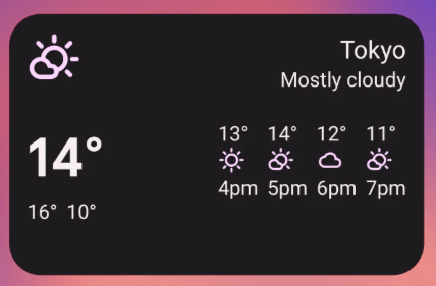
Android provides App Widgets with different sizes and interaction types. Jetpack Glance helps write these interfaces declaratively, but Glance is not an arbitrary Jetpack Compose screen: capabilities and environments differ. On Apple, WidgetKit brings together widgets, complications, and Controls; its documentation shows where these views are available.
Design a widget with four states: no data, current data, stale data, and an action awaiting confirmation. “Zero tasks” and “Could not load tasks” are different messages. The last update time is more useful than a decorative “Live” label if there is no actual continuous synchronization.
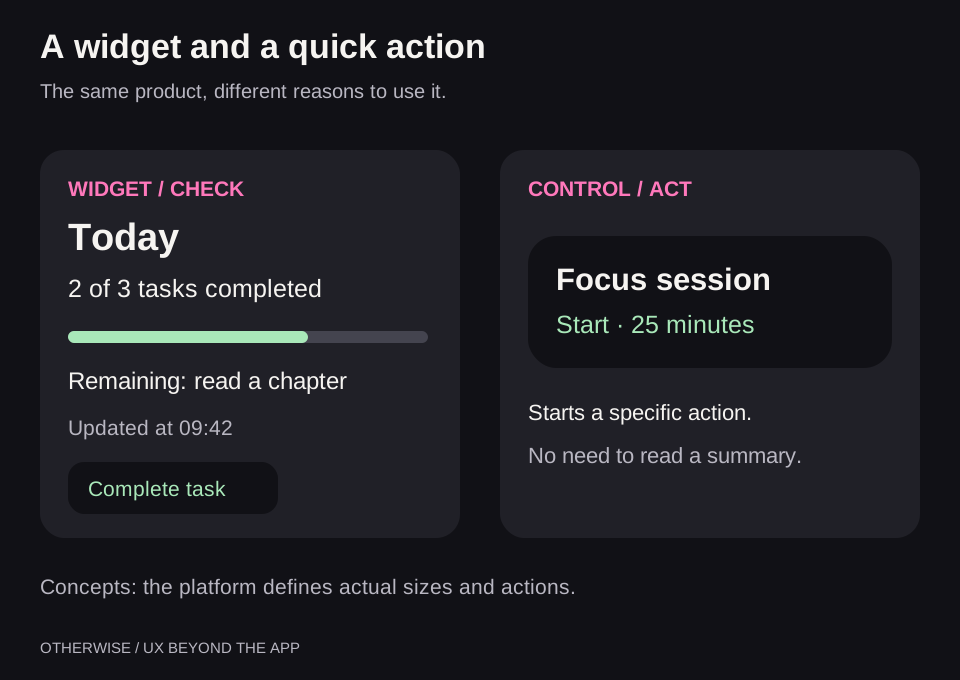
Quick Settings Tile suits a short repeatable operation: start recording, enable an app mode, or start a timer. On Apple, Controls and App Shortcuts can serve a similar product need. With App Intents, actions become available to Siri, Shortcuts, Spotlight, and other system entry points.
“Scan a document” is a good shortcut label; “Open the app” is less useful. A toggle must show state: “Recording,” “Paused,” or “Permission missing.” A command sent to a server should show waiting first, followed by a confirmed result. Pressing a button does not yet mean the door opened or the order was cancelled.
Building a useful widget instead of a miniature home page
Start with a recurring question: “What's next?”, “Which order is on its way?”, “Is the light off?” A small widget should have one main answer and a clear next step. A larger size can add context, but not a new independent version of app state.
- Tasks: a selected list, the next item, and confirmed completion of a specific task.
- Smart home: a selected device, status freshness, and an explicit command; show waiting until the device responds.
- Travel: the next flight or current order, with precise navigation to its details. Continuous observation of a short process may suit a live activity better.
- Focus session: a known end time and supported controls. Widget refresh must not pretend to be a continuously running timer service.
On Apple, you need a Widget Extension, configuration, provider, and a timeline containing real data. For user selection of an object, use WidgetConfigurationIntent and AppIntentTimelineProvider; use App Intents for interactive buttons supported on the target version. The shared data container between app and extension must actually be configured. A WidgetCenter timeline reload request does not guarantee an exact refresh time.
On Android, implementation includes GlanceAppWidget, a receiver, provider metadata, sizes, and action handlers. After saving new data, separately request an update for the relevant instance. The Glance guide explains the relationship between provider, data, and updates, while SizeMode helps prepare content for different sizes. Two widgets may have different accounts and objects; do not accidentally merge their settings.
Test adding, configuration, minimum size, resizing, removal, loss of connectivity, sign-out, and repeated taps. A preview can use sample data; the real widget must honestly show when results are absent. A regular web page can have useful panels, but its HTML does not install a WidgetKit or Glance widget on the home screen.
7. Smartwatches: not miniature phones
People look at their watches while moving, exercising, or with their hands full. A useful watch integration therefore starts by selecting information. Ten fields on the phone screen are not a reason to move ten fields onto the wrist.
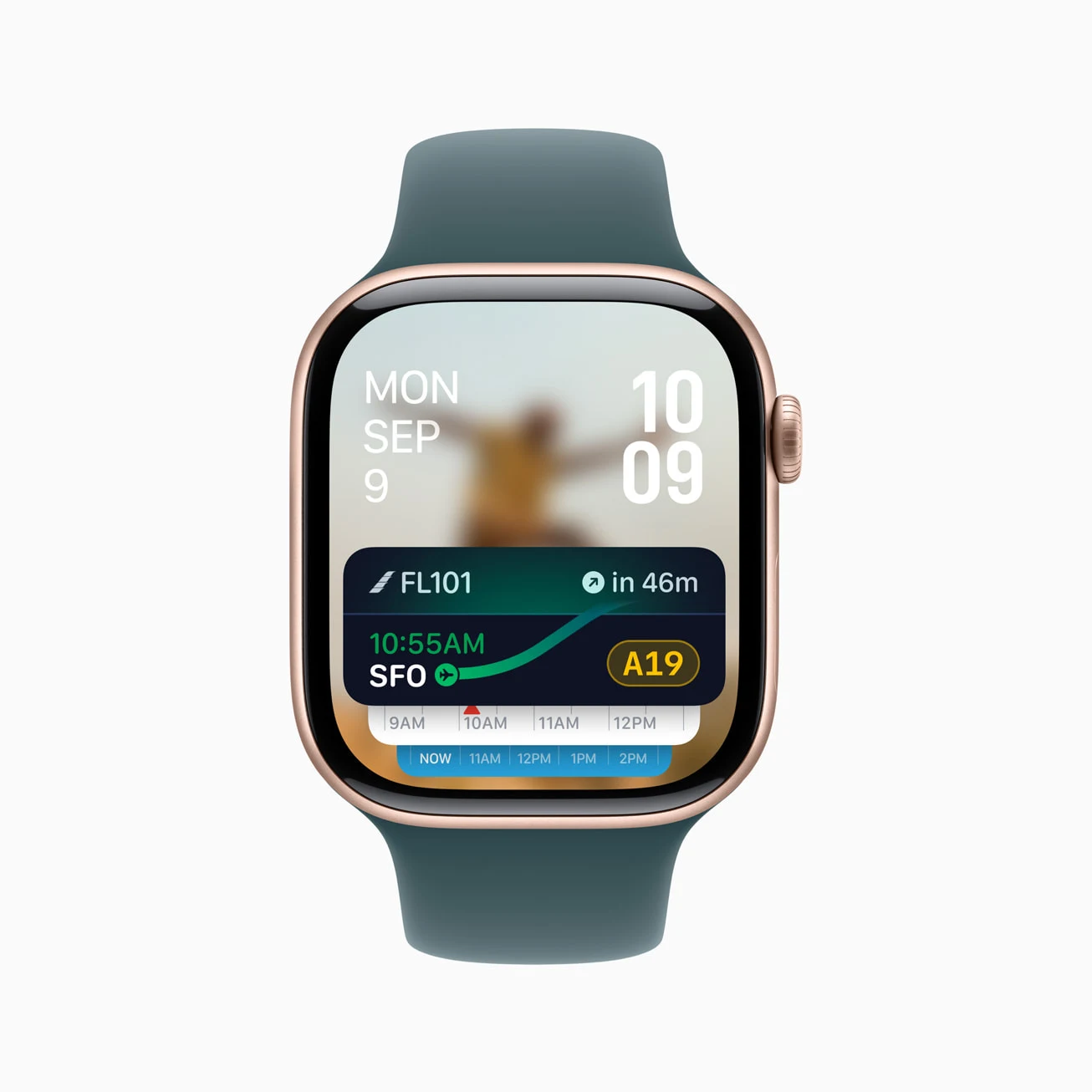
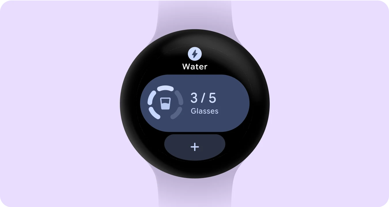
Distinguish five mechanisms: a forwarded notification, a watch-face metric, a stack card or Tile, an ongoing activity, and a standalone app. The first can work without your own watch app; the last is needed for independent logic, sensors, workout recording, and complex actions. Do not promise independence just because a phone notification appears on a watch.
On Apple Watch, an iPhone Live Activity can appear in the Smart Stack, while a custom watchOS layout allows more precise content selection. Apple also explains navigation differences depending on whether a watchOS app is installed. A watch-face complication handles an even shorter task: one metric and a clear entry point.
Wear OS includes apps, notifications, complications, Tiles, and widgets. The current map of Wear OS interfaces is therefore more useful than an old “watch face plus tiles” model. From Wear OS 7, local and phone-bridged Live Updates are documented; bridging also depends on the OEM, and excessive updates may cause data to be hidden to save battery.
Garmin is a separate ecosystem. Connect IQ distinguishes watch faces, data fields, widgets, apps, and audio content providers. For a sports product, a custom data field in a familiar workout can be more useful than a standalone app. Evaluate other manufacturers' watches and smart rings against their specific SDKs: measurement access does not imply UI access or arbitrary vibration control.
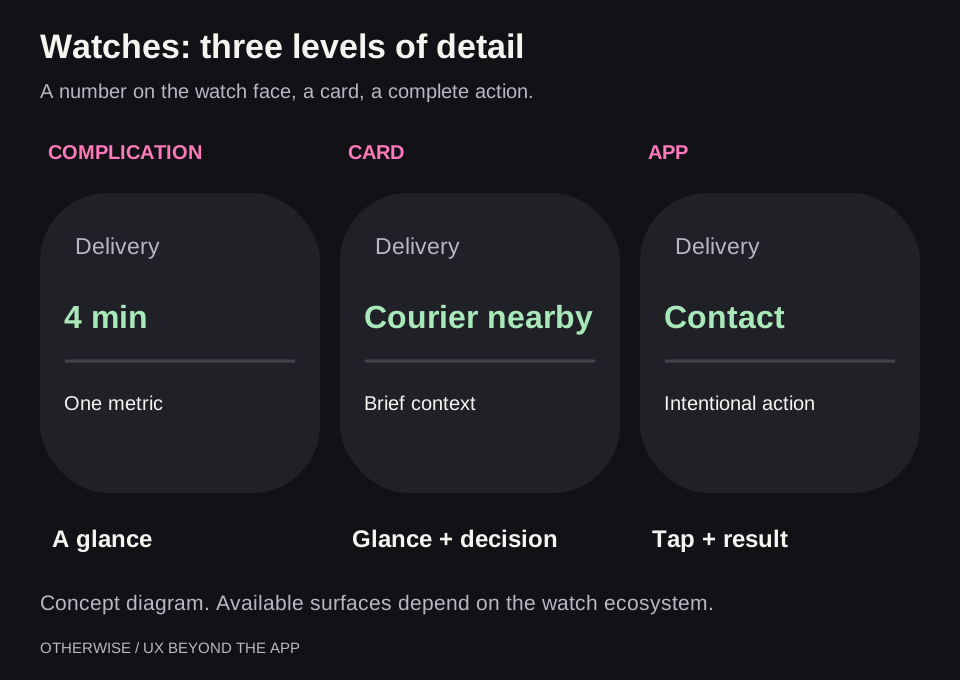
For a workout, a reasonable minimum is time, one key metric, and a large pause control. Ending the session must be distinct from pausing and protected against accidental taps. Losing the phone connection must not present an old heart-rate value as current: describe sensor availability, recording, and synchronization separately.
8. Media, calls, messaging, and floating windows
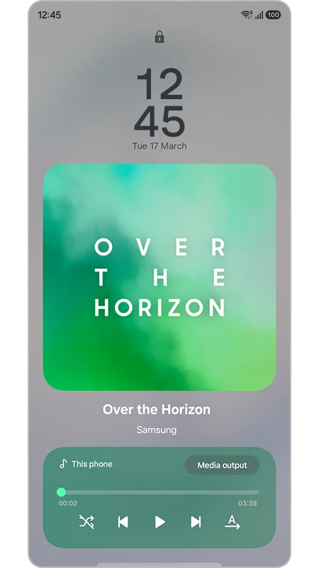
These scenarios already have system semantics. Android MediaSession sends player state and commands to the system, headphones, Android Auto, and Wear OS. A correctly implemented media session can provide more useful entry points than a custom decorative capsule. Apple's ecosystem likewise uses system Now Playing and remote command mechanisms for playback, rather than disguising the player as a delivery.
Picture-in-Picture preserves a small visual context, such as a video call or tutorial. First decide whether the user actually needs an image. For an audio podcast, pause and seeking are usually more important. For a call, microphone state, camera state, and ending the call matter; these actions must be unambiguous.
Communication supports notification replies and conversation bubbles. But that is not the only meaning of Bubbles: Android 17 adds App Bubbles as a windowed multitasking mode, separate from the messaging API. The app must work correctly in a small resizable window, preserve state, and avoid requiring a fixed full-screen size.
A custom overlay above other apps is another technology requiring separate access. It does not become part of the system island or inherit its guarantees. For an ordinary service, do not start there: first check the system surface that matches the task.
9. Wallet, QR, and App Clips: sometimes the app need not open at all
Boarding passes, tickets, passes, loyalty cards, and digital keys form a separate class of interface. The user's main question is “Will I be able to enter or use the service?” A beautiful reminder does not replace a valid pass.
Google Wallet offers different categories of digital objects. Apple's Wallet pass creation and distribution process includes certificate signing. Not every object type or capability is available to every issuer: a ticket with a code and a secure digital key are substantially different integrations.
When designing a ticket, check offline operation, current time and location details, cancellation, data changes, and actual scanner readability. Do not replace verification with a static image. For a one-time visit, a mobile purchase page, an Add to Wallet option, and a clear confirmation email may be a good combination.
QR and NFC can open the right context: a table, parking space, or device rental. On Apple, an App Clip provides a short part of a journey without installing the full app. This requires separate preparation and platform conditions. A regular mobile page opened through a QR code is simpler if the task truly fits the web.
10. External screens, cars, voice, and physical signals
Rear display: five different software contracts
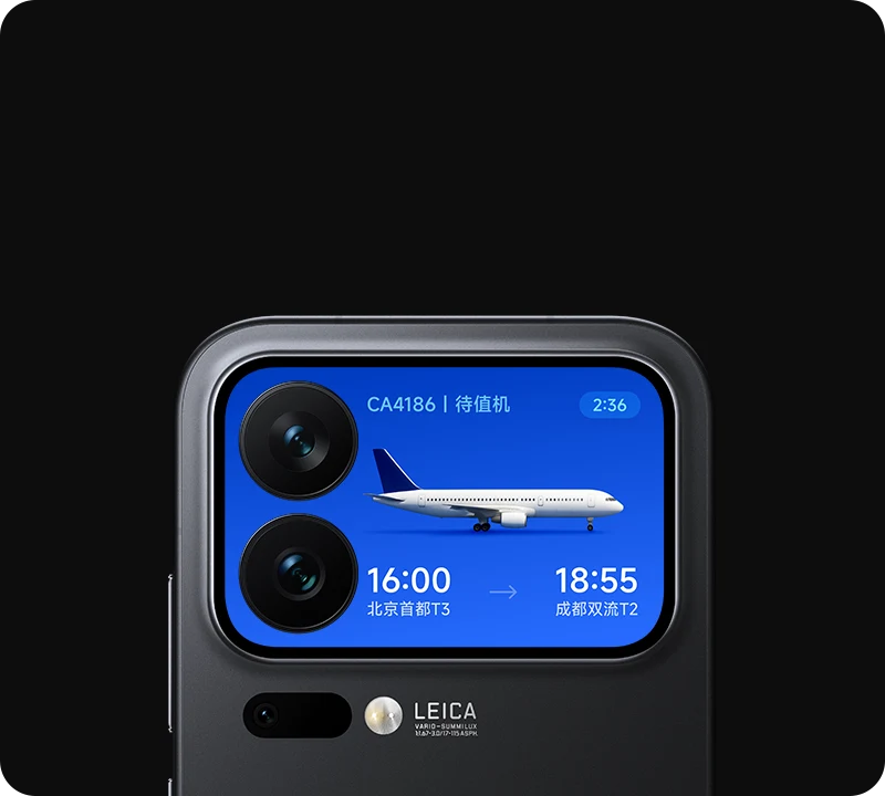
Secondary screens also exist on ordinary non-folding smartphones. But they are different surfaces: a regular Android window, a display for Presentation, a foldable device area through WindowAreaController, a manufacturer matrix with an SDK, or a system panel with a limited set of cards. Establish which contract is available to the app before choosing a layout.
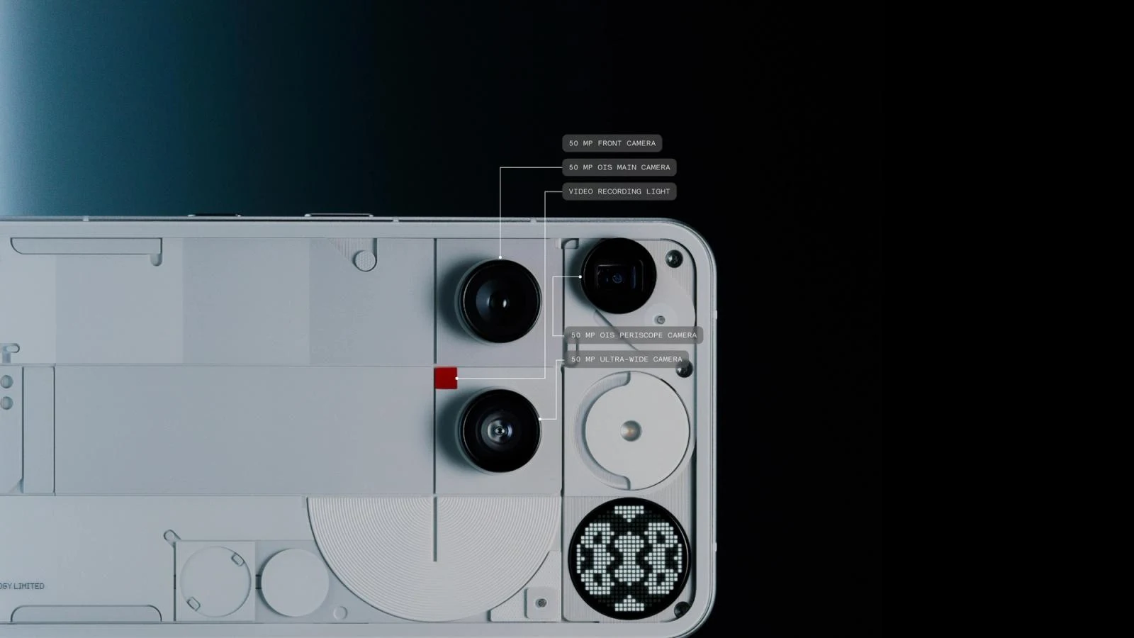
Nothing has a public Glyph Matrix Developer Kit: app output through setAppMatrixFrame() and separate Glyph Toys with their own lifecycle. Ulefone Armor 30/33 Pro documents a regular rear screen and mirroring, so adapting the app may be the first task. Xiaomi user cards and ASUS's animation editor do not by themselves prove an open API for arbitrary rendering.
The same boundary applies to websites: a browser on a second display can adapt the page, but a PWA does not gain access to a closed panel. The separate rear-display study compares Xiaomi, Nothing, Ulefone, ASUS, and DOOGEE and covers Presentation, WindowManager, and OEM SDKs.
Foldables, AOD, and moving between screens
A flip phone's cover screen is especially useful for a glance: order status, audio controls, or a short action. But an adaptive main app interface does not guarantee cover-screen access. Check the mode, manufacturer, app categories, and card publishing method. AOD is a separate context too: lower brightness, limited refresh rates, and potential data disclosure.
Handoff transfers the task itself. Android 17 provides an API for cross-device activity handoff, including data for restoring context. Its product value comes from opening the correct document, order, or work stage on the second device. Launching the home page alone does not create continuity.
Flip, Fold, and ordinary phones: adapt to the available window
An unfolded Fold's inner screen, a narrow cover screen, half a display in multitasking, and a phone with its keyboard open create different conditions for the same task. Interface selection therefore starts with available width and height, text size, system insets, and input method. The model name does not replace these measurements.
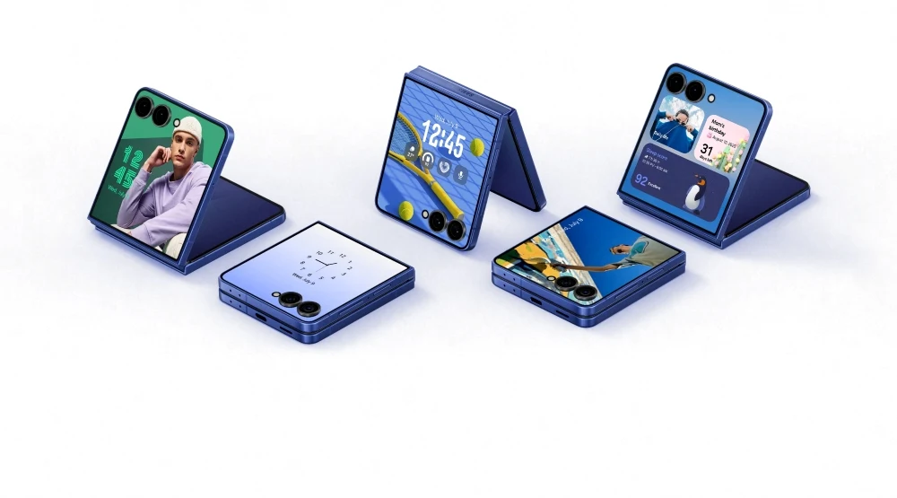
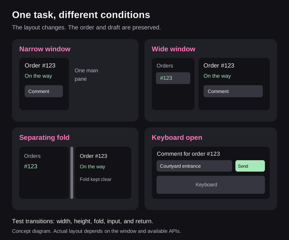
For a website or PWA, start with a fully adaptive ordinary window: Grid/Flexbox, width constraints, wrapping actions, container queries for components in different panels, and accessible scrolling. Test short landscape windows, the keyboard, zoom, cutouts, and browser bars. The dvh unit helps with dynamic height, but does not by itself solve every on-screen keyboard behavior.
If the browser actually reports screen segments, you can use horizontal-viewport-segments and viewport-segment geometry. Without this data, do not invent a hinge position from the model string. The base page must work correctly as an ordinary resizable window.
In an Android app, use adaptive layout libraries appropriate to the project: window size classes account for both width and height. Ready-made scaffold components support related lists and details. WindowManager reports fold state and geometry: whether it separates areas and occludes content. Not every fold needs an empty gap, and not every large screen needs two columns.
In an Apple app, rely on the container, safe areas, and Dynamic Type. ViewThatFits helps rearrange a local action group, while NavigationSplitView supports related panels on compatible platforms. Applying Android hinge rules to an Apple device without a corresponding API would be an assumption.
- Open a specific card and begin entering a draft.
- Change the width, rotate the window, or unfold the device; then return to the original state.
- Open the keyboard and check access to the field, error message, and main action.
- Increase text size, test a long translation, and check focus order.
- Confirm that selection, draft, navigation, and the running operation survive without restarting.
Adapting the main app does not grant permission for a Flip's closed cover screen. Verify panel access separately, then adapt the interface inside the permitted window. A narrow desktop-browser screenshot also does not verify a physical fold or a real mobile keyboard.
Cars, headphones, and voice commands
Android Auto and Android Automotive OS support specific app categories; CarPlay also defines its own capabilities and requirements. A car screen is not another place for any arbitrary card. During driving, a brief command, a large landmark, and minimal attention demands matter more.
Headphones help with navigation, playback control, and short confirmations. A voice flow should clarify ambiguity: “Which timer should I stop?” rather than stopping a random one. Confirm successful commands and avoid speaking sensitive data without considering context. Smart speakers or glasses require checks of the specific platform and interfaces available to third-party apps; do not assume a general API for “display on any glasses.”
Haptics, light, NFC, BLE, and UWB
System haptics provide feedback through touch. Design a small vocabulary of distinguishable signals: action accepted, boundary reached, attention needed. Do not encode a long message in vibrations that someone must guess.
NFC suits tapping to open context, BLE connects nearby devices, and UWB supports eligible distance and positioning scenarios. Android 16's Ranging API brings together several distance-measurement technologies, but does not add missing hardware. First check the capabilities of the device pair, then design the interaction. Proximity alone does not establish identity or grant permission to unlock a door or make a payment.
Biometrics and passkeys help confirm identity in these flows. Their role is authorization and reducing friction at a sensitive step; they are not a separate messaging channel or a reason to move every operation onto the Lock Screen.
11. What websites and PWAs can access
This is the key distinction for a web team. Installing a PWA does not automatically turn it into a native app with ActivityKit, Android Live Updates, custom complications, or OEM capsules. If the product needs such an integration, it requires a documented native path and sometimes a separate extension or companion app.
A website can still solve a substantial part of the task: a clear order-status page, a deep link, adding a ticket to Wallet through server integration, Web Push where supported, the system Share menu, a calendar event, and QR entry. WebKit supports Web Push for Home Screen web apps from iOS/iPadOS 16.4; the permission request must follow a user action. These are notifications, not permission to create an arbitrary Live Activity.
For an occasional purchase, service booking, or ticket view, a good web flow may be more worthwhile than requiring an app installation. Daily workouts with sensors and standalone watches give native development a very different justification. Choose the stack after describing the experience the audience actually needs.
12. In-app messages: banners, tips, and chat
System surfaces help beyond the main screen, but some communication should remain in the context of an action. A form-field error is best explained beside that field. A successful action does not always need a push notification as well. The following are design recommendations for choosing a format, not restrictions of a particular OS.
| Format | When it helps | What to provide |
|---|---|---|
| Inline message | Field error, explanation of a condition | Association with the element and a specific way to fix it |
| Snackbar / toast | Brief feedback after an action | An important result must not disappear without a trace; undo needs enough time |
| Banner | A state affecting current work | Cause, consequences, and next action, such as restoring connectivity |
| Dialog / modal / bottom sheet | A necessary choice or confirmation | Focus management, a clear exit, and preservation of entered data |
| Tooltip / coach mark | Explaining an unfamiliar element | Access without hover, a skip option, and no endless repetition |
| Support chat / AI widget | The user needs help with the task | Context, history, capability limits, and handoff to a person |
| Message center | Keeping significant events and their history | Read/unread state, filters, and navigation to a specific object |
A floating chat must not cover checkout, the keyboard, or primary actions on a phone. Automatic expansion is not the same as useful help. “Need help with delivery?” is more appropriate after a real problem than a generic popup ten seconds after arrival.
For an AI assistant, distinguish an answer, a proposed action, and a completed action. “I can reschedule the appointment” does not mean “the appointment has been rescheduled.” Before a change, show the selected object and material consequences; afterward, show the confirmed result. If no answer is found, name the limitation and offer an available support path while preserving the request's context.
Email, SMS, and messenger messages form another class: external delivery channels. Choose them based on consent, urgency, and how long information needs to remain available. A receipt is worth keeping; every minute of trip status should not be duplicated across all channels. A push failure alone does not justify sending an SMS without predefined rules and consent.
13. Practical scenarios: exactly what to bring outside
| Product | Main combination | Content | Common mistake |
|---|---|---|---|
| Food delivery | Ongoing activity + order screen | Stage, ETA, action on arrival | Presenting a probabilistic forecast as an exact timer |
| Taxi | Live status + short watch signal | Time, pickup location, car | Hiding a change in meeting point |
| Long-distance parcel | Regular events + tracking page | Stage changes | Keeping a live card for several days |
| Fitness | Watch app + ongoing activity | Time, key metric, pause | Treating notification mirroring as independent recording |
| Focus and timers | Quick command + timer + completion | Remaining time and pause | Second-by-second network push |
| Music and podcasts | System media session | Pause, seeking, current content | Duplicating the player with another activity |
| Video calls | System call + PiP where appropriate | Microphone status and ending the call | Unclear recording or camera state |
| Tickets and travel | Wallet + change notifications | Location, time, entry code | Confusing a reminder with a valid ticket |
| Smart home | Widget + Control/Tile | Command and confirmed state | Showing “open” before the device responds |
| AI generation and export | In-app progress + completion notification | Actual stage, error, result link | Invented percentages and an unjustified permanent live card |
| Banking transaction | Neutral notification + protected screen | Verifiable action result | Showing sensitive details to everyone nearby |
| Habits and tasks | Widget + short action | Today's progress | A constant anxious reminder that cannot be disabled |
A delivery over time
Order placed: confirmation and access to details. Preparing: a quiet status, if the platform permits the scenario. Courier approaching: ETA and meeting location become the priority. Courier arrived: the card's meaning changes — now an action is needed, not another percentage. Order received: active tracking ends; history stays in the app. Asking for a rating is a separate task, not a reason to keep the island occupied.
If the forecast changes from four to seven minutes, show that honestly. If location updates stop, do not confidently continue counting down to arrival. A timer's local passage of time is known; for a courier, it cannot replace fresh data.
An AI task in detail
Document generation benefits from real stages: “analyzing materials,” “assembling a draft,” and “checking the result.” If the server does not measure completion, avoid drawing a percentage. Completion should lead to the specific result; an error should lead to a clear explanation and an allowed retry. A live surface is appropriate only after checking platform criteria and the need for continuous observation.
14. The most important design work is invisible states
A beautiful mockup usually shows one successful minute. A real product must survive lost connectivity, sign-out, completion, repeated messages, and revoked permissions. The recommended model distinguishes task state from presentation state.
- Task: created, active, paused, requires action, completed, cancelled, failed.
- Data: current, stale, unavailable.
- Presentation: not created, display requested, access restricted, hidden by the user, ended.
“The user removed the card” does not mean “the user cancelled the taxi.” “The app process was removed” does not mean “the order ended.” “The provider accepted the push” does not mean “the screen updated.” Separating these concepts prevents an entire class of support and analytics errors.
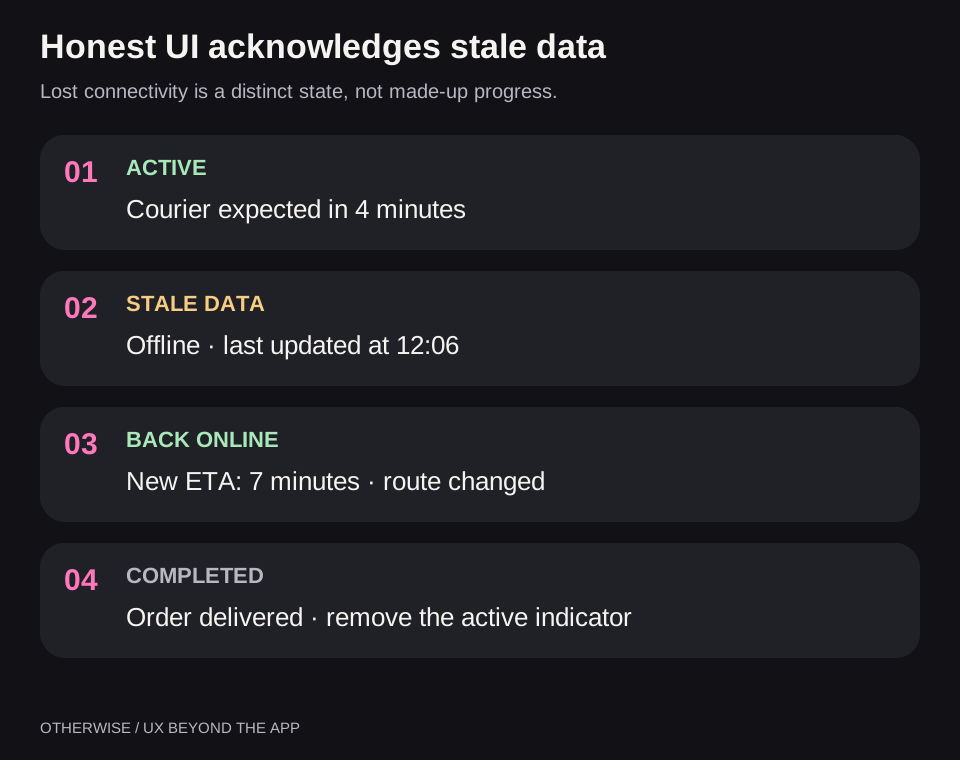
Define a freshness window for each data type. A delivery ETA and a meeting start time become stale differently. After the window expires, the card must stop pretending to show a confirmed current state. Sometimes “data as of 12:06” is enough; sometimes the metric must be removed or the view ended. Choose the rule according to the scenario and available APIs.
Design the ending separately: immediate removal can deny people the final result, while a permanent card creates visual clutter. For each surface, define what remains after completion, for how long, and where a tap leads. Platform limits take precedence.
15. Architecture: one task, separate adapters
For a cross-platform product, separate business state from update transport and visual presentation. The server knows the order state. A local timer knows its end time. An adapter knows which data and actions are allowed on a particular surface.
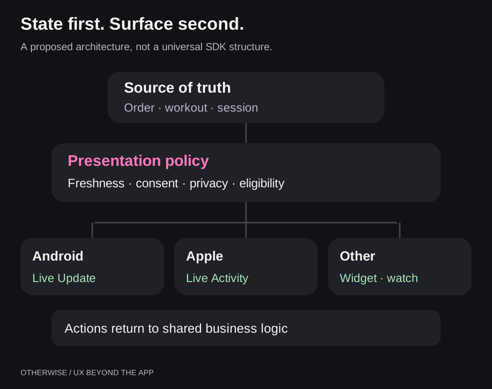
An illustrative event model might look like this. This is the app's own schema, not an SDK format:
{
  "activityId": "delivery_204",
  "revision": 18,
  "phase": "courier_approaching",
  "updatedAt": "2026-11-05T12:06:00Z",
  "validUntil": "2026-11-05T12:08:00Z",
  "estimatedArrivalAt": "2026-11-05T12:10:00Z",
  "allowedActions": ["open_order", "contact_courier"],
  "privacyClass": "personal"
}
revision helps reject late updates. validUntil sets how long the data can be trusted. estimatedArrivalAt stores the estimated time rather than a preformatted “4 min” string. Localization and presentation remain the adapter's responsibility. The privacy field determines which details may reach a public surface at all.
But JSON alone guarantees nothing. You need duplicate and out-of-order handling, recovery after restart, revocation of invalid tokens, correct update termination, and safe deep links. Recheck the account and access when opening an order: an identifier in a link is not authorization.
Commands from different surfaces must reach the same business logic. If someone taps “Pause” on their watch and phone almost simultaneously, the two requests must not toggle the workout back on. “Set paused” is better for this scenario than blindly “invert state,” together with operation-level idempotency.
Choose transport separately: APNs/ActivityKit, Android notifications, OEM push, local updates, or watch synchronization. Do not assume a live interface keeps the app process in memory. Nor should a foreground service be used solely to retain an advertising card. The background work plan must match the actual task and OS rules.
16. Permissions, privacy, accessibility, and the cost of attention
From Android 13, most notifications require POST_NOTIFICATIONS. Ask when the benefit is clear: after “track this trip,” not over the first introduction to the app. If permission is denied, show where to check status manually; do not repeat the same request on every launch.
An additional surface must respect people's settings. Dismissal, muting, Focus mode, and hiding Lock Screen content are part of the scenario. Moving a disabled notification into an aggressive overlay is not a valid way to honor the user's choice.
For privacy, prepare separate safe content: “There is an order update” instead of an address, name, and amount. A sensitive action must pass the required identity check. Opening details and confirming a financial transaction require different authority, even if both buttons fit on one card.
Accessibility requires readable labels, meaning independent of color, larger text support, and correct action names for screen readers. “Pause workout” is clearer than two unexplained vertical strokes. Check long-word localizations, time formats, units, and text direction. Apply these requirements to watches and AOD while accounting for their constraints.
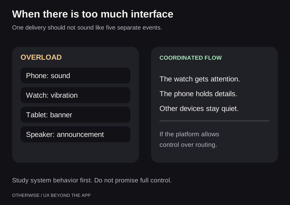
Not every stage change deserves a vibration. Delivery can distinguish a quiet status change from the moment someone needs to go outside. A timer gains nothing from a sound on every update. With multiple devices, first study how the system forwards notifications, then add your own rules to avoid two independent channels for one event.
17. What to test before release
Build the test matrix from the combination device × OS build × region × app version × settings × scenario. Brand and Android version are insufficient. A critical OEM integration needs testing on a real device from the target market, not just an emulator.
| Condition | What to check | Success criterion |
|---|---|---|
| Permission not granted or revoked | Main flow and explanation of settings | The person knows where to get status |
| Lock Screen, AOD, watch | Readability, privacy, actions | No unnecessary disclosure or falsely available command |
| Network loss | Freshness window and reconnection | Stale state is clearly distinct from current state |
| Process removed, device restarted | State recovery | No lost or “permanent” activity |
| App force-stop | Separate from ordinary process removal | Behavior documented; delivery is not promised without evidence |
| Duplicate and reordered messages | Revisions and deduplication | A completed order does not return to in-transit state |
| User dismissal | Stop unwanted display | The card does not reappear without justification |
| Multiple activities | Priority and the correct deep link | Tapping opens the right order |
| Sign-out and account switching | Private-state cleanup | Old details are unavailable to the new user |
| Watch without phone, power saving | Independence, sensors, synchronization | No false promise that “everything is recording” |
| Large text, screen reader, another language | Truncation, reading order, button names | Main meaning and action remain accessible |
| Completion and cancellation | Stopping updates and retention period | No stale active indicator |
For each run, retain the model, firmware region, exact build, permissions, and observed result. “It works on our Samsung” cannot be reproduced. “On this model and build, with these settings, the delivery received a Lock Screen card” is already a useful compatibility record.
Minimum readiness criterion: the user understands the state, can perform the required action and stop display, receives no stale data disguised as current, and retains a working path when the additional surface is unavailable.
18. Measuring benefit when app opens decrease
A successful integration can reduce app opens. If someone previously checked the courier five times and now looks at their watch once, falling app opens do not imply a worse product. Tie metrics to task completion instead.
- Effort: number of transitions and time to answer a specific question.
- Outcome: successful pickups, completed actions, proportion of missed important changes.
- Reliability: update latency, stale-state incidents, command errors.
- Cost: battery, network, maintenance cost of different integrations.
- User control: disabling, dismissal, complaints about repeated signals.
Distinguish funnel stages: the device supports the mechanism → permission granted → request accepted → presentation state confirmed by an available API → human interaction → task completed. There may be no API for actual viewing. Do not record an “impression” merely because the server sent a push, and do not automatically interpret no tap as no benefit.
Prioritize using your own data: share of eligible scenarios, share of compatible devices, frequency, and expected reduction in effort. This is an estimation model, not a proven industry coefficient. After launch, compare equivalent groups; people who add a widget themselves may have been more active even before the experiment.
19. A practical implementation plan
- Describe one task. Who is waiting for which change, what they do next, and when display ends.
- Check the audience. OSs, models, markets, watches, and scenario frequency. Do not choose an OEM based on an impressive presentation.
- Build the base path. Trustworthy state in the app or website, necessary notifications, correct links, and permissions.
- Choose one external surface. Delivery — ongoing activity; habits — widget; audio — media session; workout — watch.
- Describe every state and action. Include staleness, dismissal, and completion. Then draw sizes and animation.
- Check platform access. Public API, versions, OEM approval, region, limits, and distribution rules.
- Launch to a limited compatible group. Check task outcomes and the attention cost; expand after confirming value.
This sequence does not prescribe a universal “islands first, watches later.” A music app's first investment is a media session; a sports app's is an independent wrist-based journey; a ticket product's is Wallet. The best surface helps your audience in its actual context.
Discover project opportunities first, then choose scenarios
Both skills support a separate discovery mode. The agent examines real screens, user tasks, data, native targets, and existing API integrations, then proposes suitable scenarios: which repeated work they remove, where they will be available, what implementation is missing, and the size of the changes. Formats and integrations that do not suit the project should receive a clear explanation rather than appear on a mandatory list.
Proposals receive short IDs. The person chooses what to implement now, defer, or exclude; the agent preserves that choice and implements the selected work. A recommended set is not itself the user's decision. If a specific task has already been assigned — for example, building an orders widget — there is no need to choose again.
Example request: $interaction-surfaces — “Analyze my project and suggest useful scenarios with their benefits, dependencies, and complexity estimates. Let me choose before implementation.” The same mode for adapting an interface to window size and device posture is available in $adaptive-interfaces.
A separate skill for adaptive websites and apps
This research led us to create open skills for Codex and Claude Code: Interaction Surfaces and Adaptive Interfaces. They analyze an existing website or app, identify available APIs, and suggest useful improvements such as widgets, ongoing activities, watch experiences, secondary displays, and adaptive layouts. You choose which scenarios to implement, defer, or leave out; the agent then implements the selected changes and verifies them within the available platforms and devices.
To work with window formats, you can install Adaptive Interfaces from its GitHub repository. The English package covers web/PWA, Android, Apple, React Native, and Flutter: narrow windows, landscape, Flip/Fold, folds, keyboards, safe areas, text scaling, and preserving the task during transitions.
In Codex, pass this command to the built-in installer:
$skill-installer install https://github.com/wladislaw353/agent-skills/tree/main/skills/adaptive-interfacesAfter cloning the repository, place the contents of skills/adaptive-interfaces in ~/.agents/skills/adaptive-interfaces/. To invoke it explicitly, use $adaptive-interfaces; automatic selection for a matching task is also allowed. Manufacturer-screen access and real device testing are still required for the relevant integration.
A skill for Codex and Claude Code: apply the approach to your project
You can give the approach from this series to an AI agent: install the Interaction Surfaces skill from GitHub. The package is written in English and helps choose useful interaction surfaces while developing an interface, even when the task has not yet mentioned islands, widgets, or watches.
It includes implementation instructions, examples, and links to official documentation:
- Useful widgets: selecting a recurring task, WidgetKit, Android App Widgets/Glance, configuration, actions, data, and updates.
- Android: Live Updates, permissions, ProgressStyle and MetricStyle, a Kotlin example, promotion diagnostics, and OEM scenario integration.
- Apple: ActivityKit, WidgetKit, Dynamic Island states, a Swift example, App Intents, and APNs updates.
- Watches: Apple Watch and Wear OS, complications, widgets and Tiles, HealthKit, Health Services, WatchConnectivity, and Data Layer.
- Secondary displays: DisplayManager, Presentation, WindowManager, Glyph Matrix, and verification of actual access to manufacturer panels.
The skill separately covers stale data, loss of connectivity, permissions, task completion, and device testing. Its instructions help implement an integration; they do not replace SDK access, manufacturer approval, or testing a specific model.
Install from GitHub: in Codex, pass this command to the built-in skill installer:
$skill-installer install https://github.com/wladislaw353/agent-skills/tree/main/skills/interaction-surfacesIn Claude Code, you can install the whole collection from the same GitHub repository as a plugin. The separate Claude Code instructions contain installation and update commands. After installation, you can use /agent-skills:adaptive-interfaces and /agent-skills:interaction-surfaces. When installing individual folders manually in ~/.claude/skills/, use the short names /adaptive-interfaces and /interaction-surfaces.
Installation: clone the GitHub repository and copy the entire skills/interaction-surfaces folder into ~/.agents/skills/. The file should end up at ~/.agents/skills/interaction-surfaces/SKILL.md; keep the references and agents folders alongside it. This is the user directory described in OpenAI's documentation on local skills.
To invoke it explicitly in Codex, write $interaction-surfaces and describe the task, for example: “Design order tracking for iOS and Android, choose appropriate external surfaces, and implement them in the current project.” Automatic skill selection is also allowed. If it does not appear after installation, restart Codex.
Frequently asked questions
Can you build one Dynamic Island for every phone?
You can unify state and the meaning of actions. There is no single arbitrary visual component for every system: presentation, constraints, and access are determined by platforms and manufacturers.
Can a website alone be enough?
For order status, tickets, QR entry, and some notifications — often yes. ActivityKit, custom complications, or a specific OEM integration require the appropriate native mechanism. A PWA does not grant those capabilities on its own.
Do watches need separate apps?
Not always for forwarding certain notifications and Live Activities. Independent interactions, workout recording, and custom logic generally need a separate implementation on the watch platform.
Can you keep a card visible permanently for retention?
That approach conflicts with the purpose of ongoing activities and the criteria of several platforms. For regular voluntary access, consider a widget or shortcut that users add and remove themselves.
How often should data update?
On meaningful changes and within the chosen channel's rules. A system timer can display time, while a delivery estimate needs fresh data. No universal update frequency applies to every mechanism.
Which integration matters most?
The one that removes repeated effort for a substantial share of your audience. Scenario, availability, and measurable results determine priority, not the capsule's shape.
A good external interface disappears at the right time
The strength of these technologies is that people do not have to keep serving an app with their attention. They get an answer, make a decision, and continue with their day. That takes more than an attractive animation: a clear task model, trustworthy data, respect for settings, and verified compatibility.
Design for the least effort needed to finish a task, not the greatest number of places to show the product. Then islands, widgets, watches, and physical signals become parts of one useful service.